AUTOMOTIVE EXCELLENCE QUARTERLY
A quarterly magazine for automotive repair shop owners and professionals.
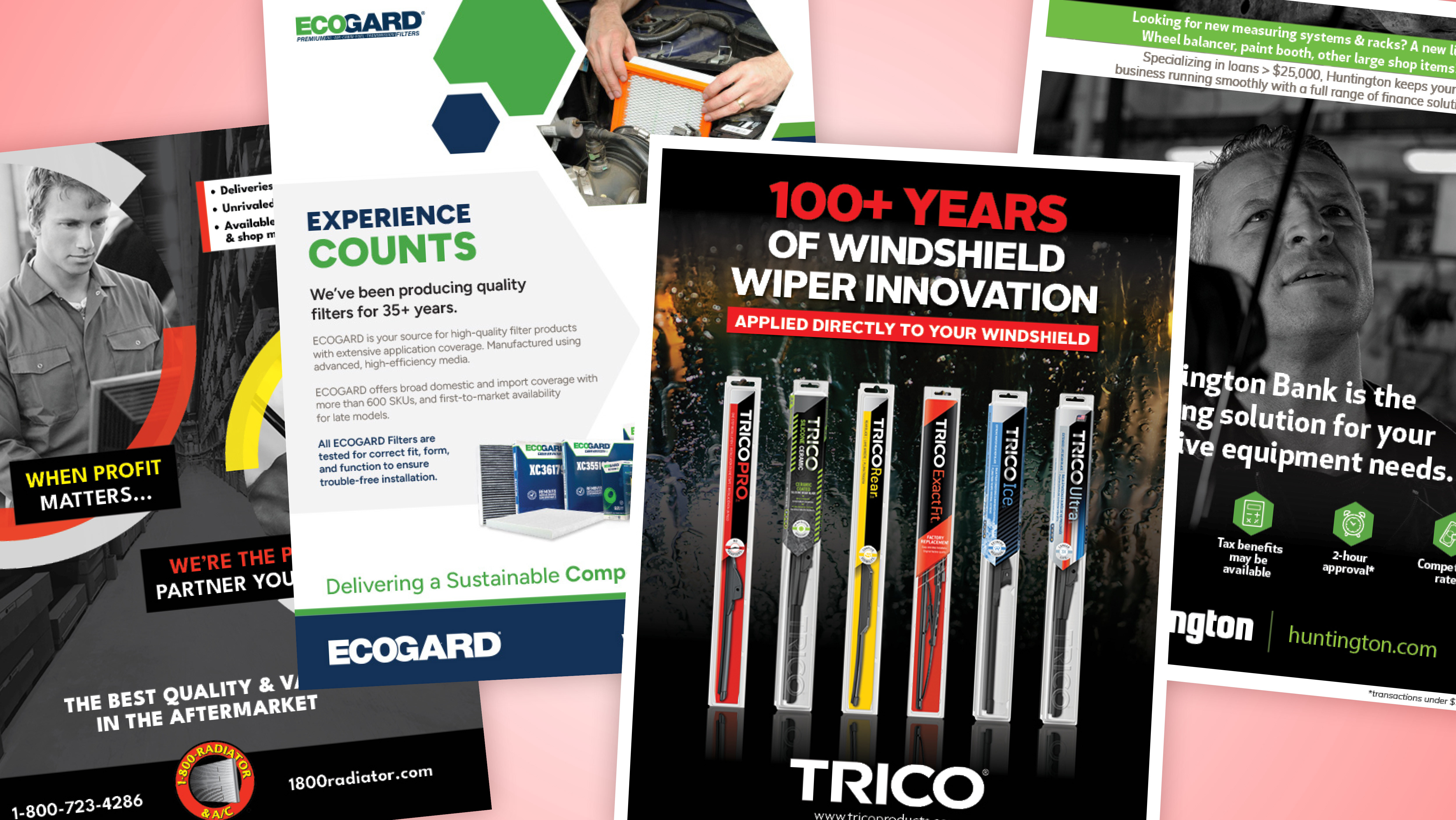
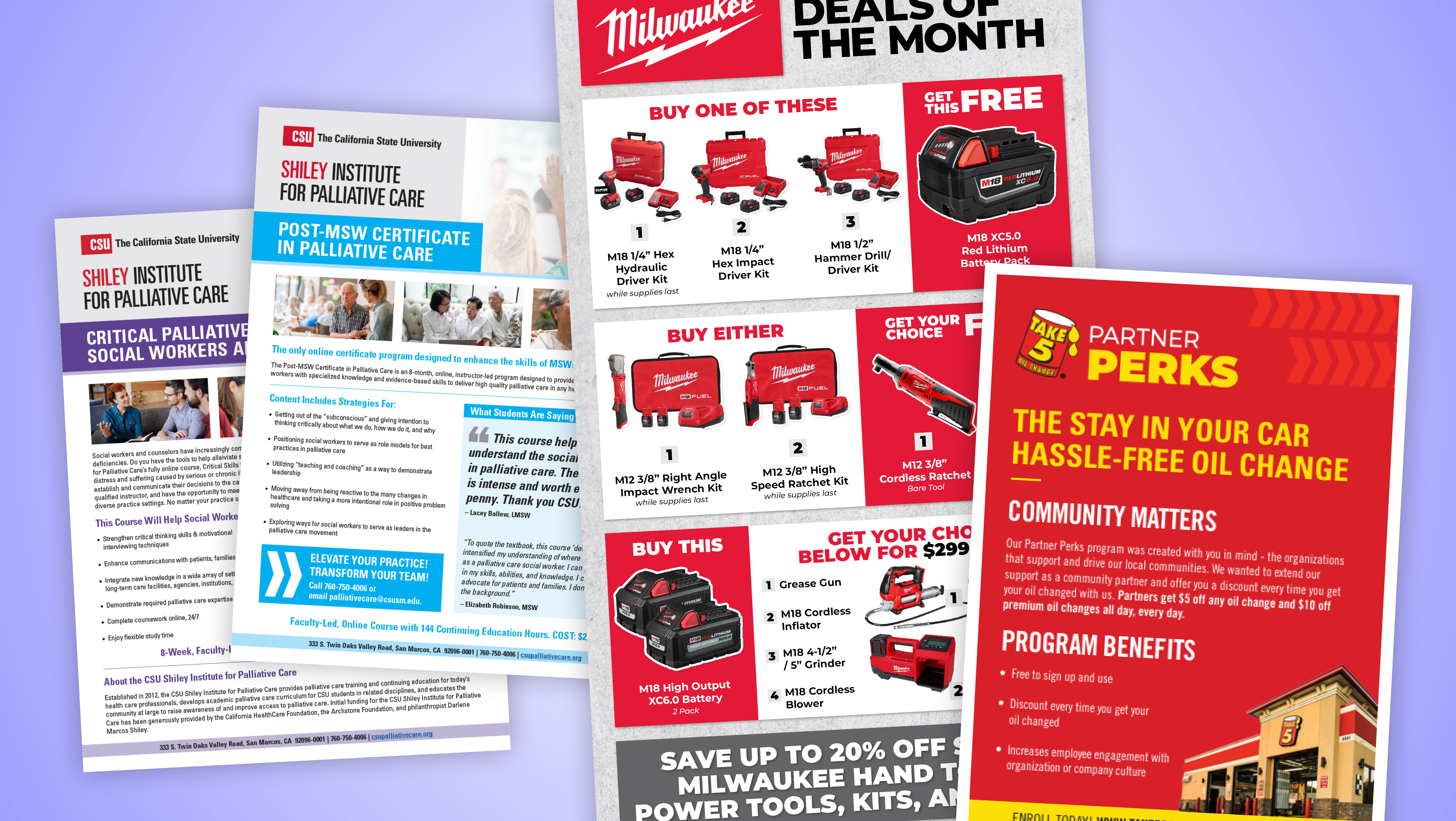
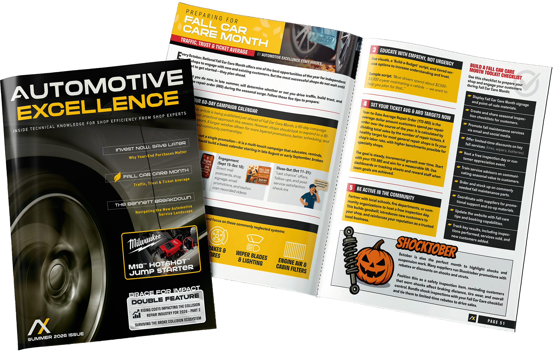
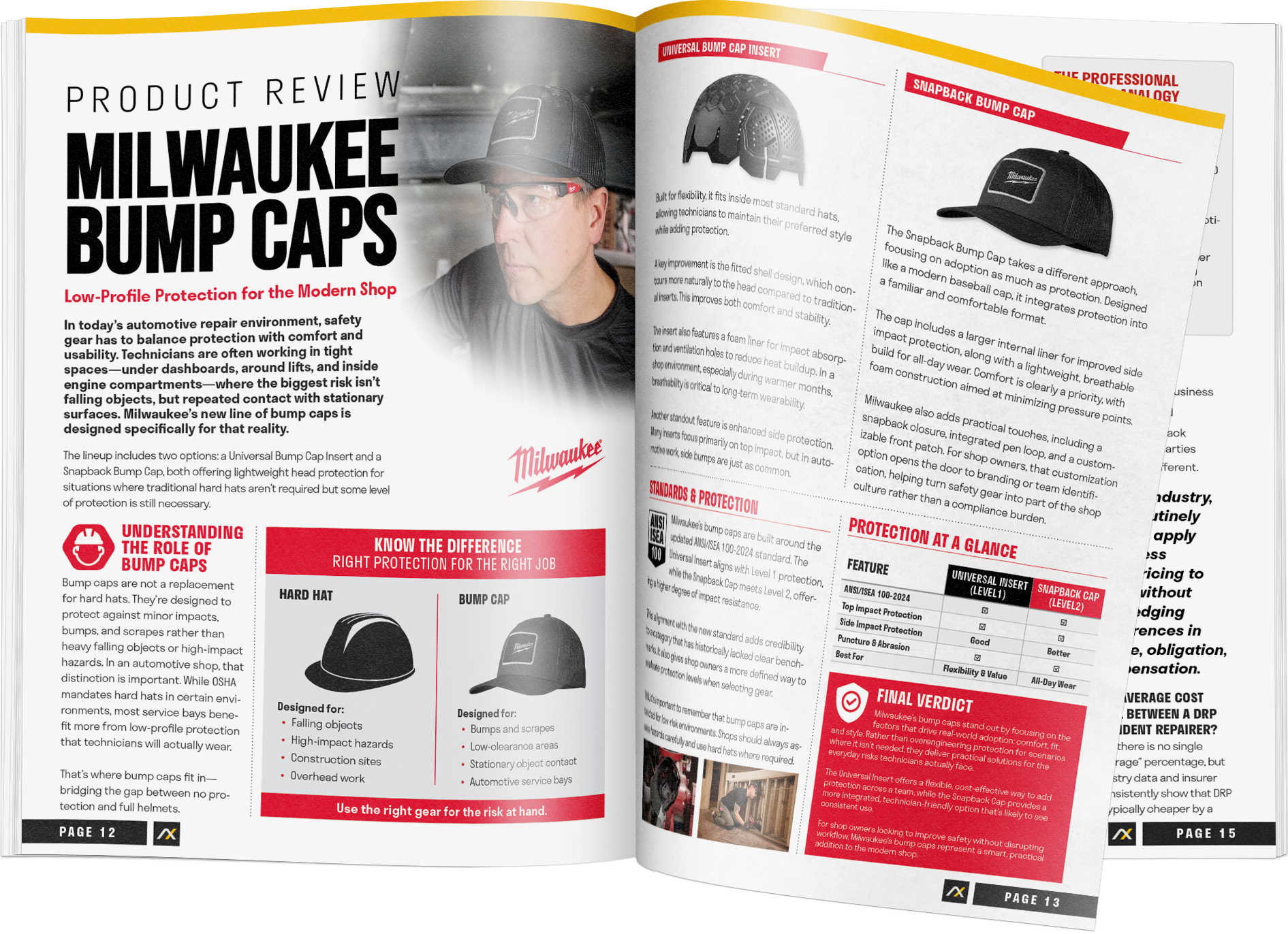
This publication lives in the automotive aftermarket, where attention is short and clarity matters. Every page was designed to land quickly, communicate clearly, and move the reader forward. Big type, structured layouts, and unapologetically bold hierarchy weren’t stylistic choices, they were functional ones. In this space, subtle design gets ignored. So we didn’t make subtle design.
The entire magazine was created by a two-person team: myself and the Director of Marketing. Together, we handled everything from concept to final production, including editorial layout, visual systems, and multiple full-page advertisements. Several of those ads were developed in collaboration with nationally recognized brands, requiring us to stay tightly aligned with their established fonts, colors, and guidelines while still making everything feel cohesive within a single publication.
The content itself sits at the intersection of editorial and sales. Technical articles, shop metrics, product reviews, and business strategy all needed to feel useful, not just well-designed. This meant building layouts that could carry dense information without overwhelming the reader, and structuring content in a way that made it easy to scan, digest, and actually apply.
The result is a magazine that feels more like a working tool than a piece of marketing. Direct, structured, and built for real-world use. Designed to meet the audience where they are, not where we wish they were.
SKILLS USED
Creative Direction
Brand Identity
Advertising Design
Editorial Design
Page Layout
Brand Identity
Advertising Design
Editorial Design
Page Layout
California State University
Curriculum Materials
Curriculum Materials
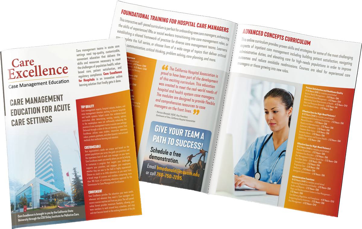
This piece is part of a larger visual system created for CSUSM’s Care Excellence program, which outlines a wide range of curriculum and educational pathways for hospital care managers. The goal for this layout was to take a dense set of offerings and present them in a way that feels clear, structured, and easy to move through.
The design focuses on hierarchy, rhythm, and breathing room. The curriculum covers everything from utilization review foundations to advanced care management concepts, so the page uses strong section headers and clean typographic grids to guide the reader through each track without overwhelming them.
The overall tone reflects the mission behind the program. It supports care managers with education that is high quality, flexible, and accessible. By pairing organized content blocks with subtle visual cues, the layout helps transform complex information into an intuitive and engaging experience for learners and decision makers
SKILLS USED
Creative Direction
Brand Identity
Editorial Design
Page Layout
Brand Identity
Editorial Design
Page Layout